Video Player is loading.
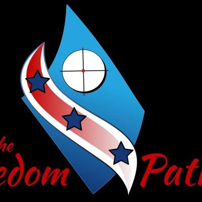
Freedom Patriot - Vortext Logo Reveal
David Niezby - 2,577 Views
1
0
Published on 29 Aug 2018 / In Film and Animation
I didn't like the way the logo lettering at the bottom appeared so I added it directly to the logo design and I think this looks better. Choosing one of these designs isn't easy. I like all of the versions but I'm clearly biased.
Please be sure to check out our other logo ideas and let us know what you think in the comments.
Electric Logo - http://bit.ly/2omYbjj
Glossy Logo - http://bit.ly/2Nb0Drn
Please be sure to subscribe and like our videos. Also, take a moment to visit our advertisers so we can grow this channel and bring you more content.
Show more
0 Comments
sort Sort by


