


![[DS] Is Repeating Everything, Which Failed, Panic Is Off The Charts - Episode 2272b](https://video.ugetube.com/thumb/GByoC0ROnf0_nqK38gBraYMtO8L.jpg)


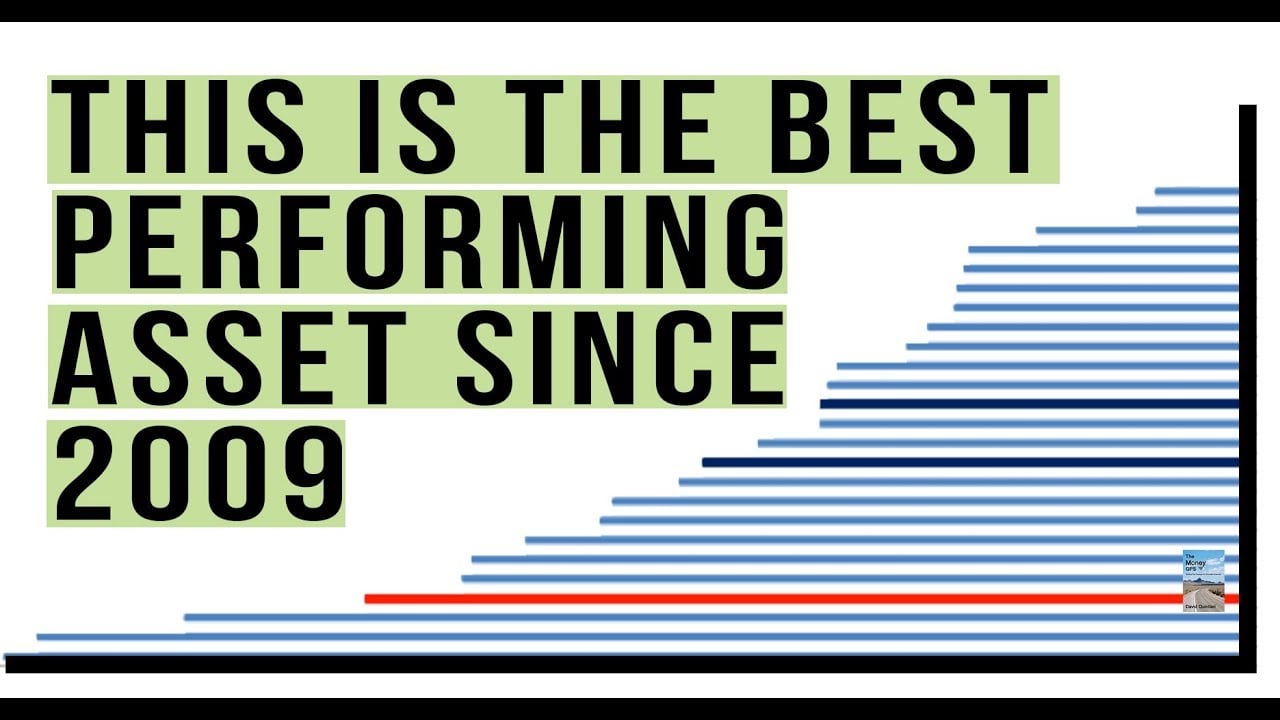
3 Charts Tell You Where to Invest Your Money! Which Is Performing Better Right Now?

Look Through My Books!: http://books.themoneygps.com
Support My Work: https://www.patreon.com/themoneygps
PayPal: https://goo.gl/L6VQg9
BitCoin: 1MbAUXsHa8XRFMHjGurd7L5nRDYJYMQQmq
My Free eCourse to Unveil the TRUTH:
http://themoneygps.com/freeecourse
Tools You NEED to Prepare for the COLLAPSE:
http://themoneygps.com/store
********************************************************************
Sources:
Stock-To-Bond Ratio Back At 2007 Peak | Zero Hedge
http://www.zerohedge.com/news/....2017-04-02/stock-bon
United States 30 Year Bond Yield | 1977-2017 | Data | Chart | Calendar
http://www.tradingeconomics.co....m/united-states/30-y
v2.png (743×536)
https://hurricanecapital.files.....wordpress.com/2015/
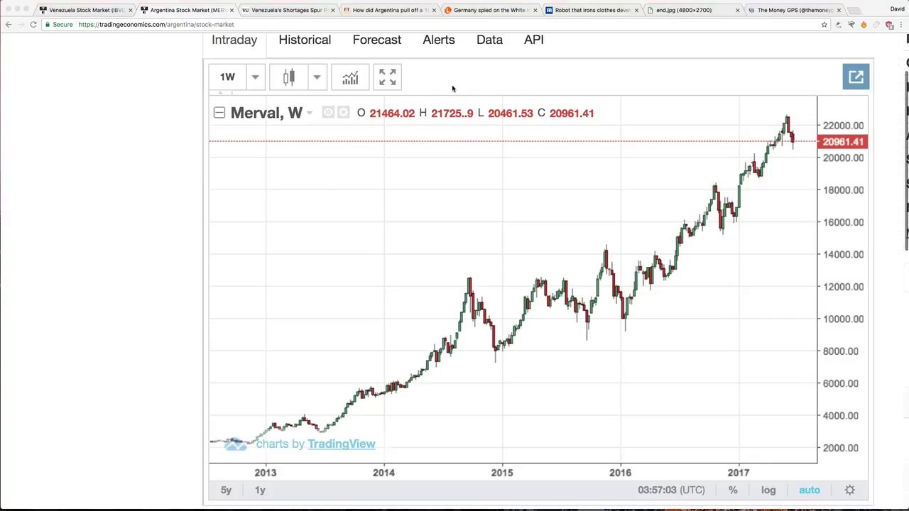
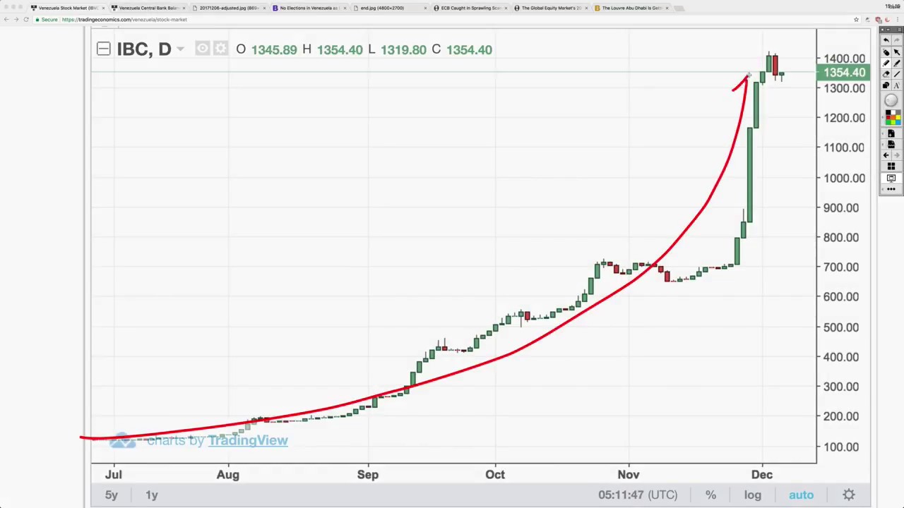
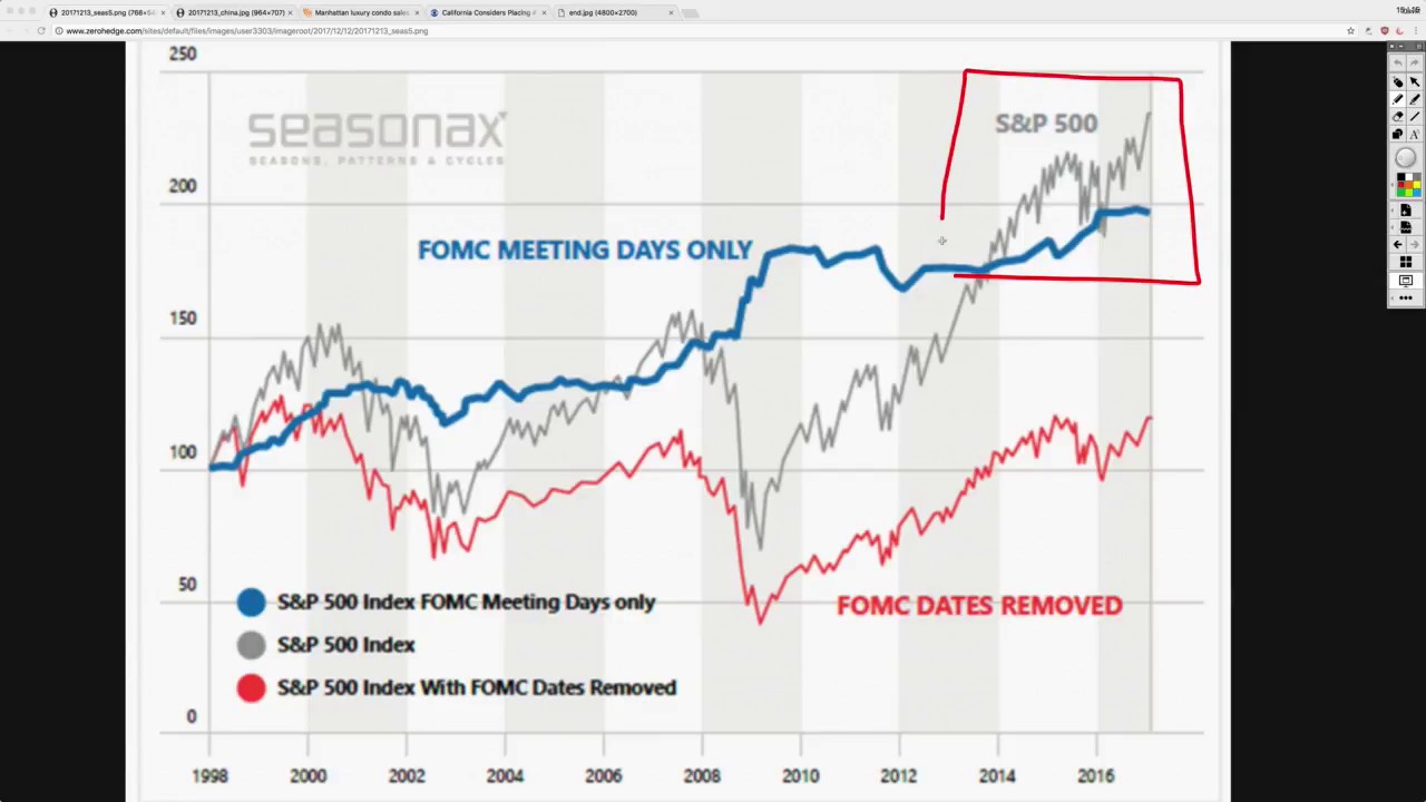
stocks bonds cash currency financial investment chart s&p 500 dow jones money stocks